- Electrical Safety First’s new visual identity harnesses ‘green electrical glow’ and ‘on’ power icon.
- New strapline ‘Powering change + saving lives’ reflects life-and-death role as campaigning consumer champion.
Leading UK safety charity, Electrical Safety First (ESF), today unveils a new visual brand identity. Click here to access a selection of the brand assets.
The rebrand comes as electricity increasingly plays a bigger role in people’s lives than ever before due to the UK’s climate objective of net zero carbon emissions by 2050. Even at present, over half all UK domestic fires are caused by electrical faults. With the charity’s mission propelled into more significance than ever, ESF is expanding its ambitions accordingly, to ensure people avoid deaths and injuries caused by electricity.
The rebrand was informed by an extensive brand audit, comprising quantitative and qualitative research among key audiences and stakeholders, as well as market and competitor analysis. The branding agency, Garden, led both the brand audit and brand development project, working with ESF’s Head of Communications, Rory Carroll.
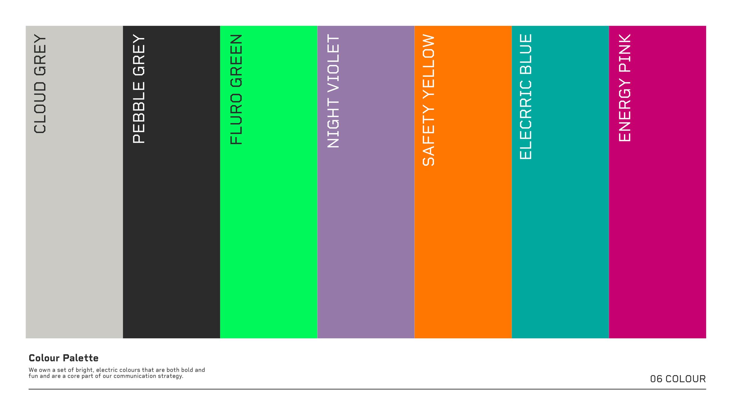
AI software-supported colour analysis that showed Electrical Safety First’s existing primary colour, red, was by far the most used amongst charities but was particularly associated with health issues, echoing blood and danger. Whilst the latter connotation was relevant to ESF as a safety charity, the decision was made to break with this in favour of electric green, with a distinctive ‘glowing’ effect to symbolise ‘power on’ common amongst electronic items and to represent consumers making a positive change in their electrical safety. This was not a common association with green when red was chosen as the charity’s primary colour.
This chimes perfectly with the creation of a new primary brand mark that replaces the previous ‘coil’-like icon, with a distinctive logo that represents both ‘e’ – being short for “electrical” – and the ‘power on’ icon universally seen in all electronic devices for many decades, whether on laptops, smartphones or televisions.
The previous colour palette of red, brown, blue, green, yellow and grey reflected colours of different types of electrical wiring. Whilst this was an innovative idea, in practice it was rare for all colours to be seen together and therefore for that connection to be made with audiences. The colours also did not complement each other in execution. A vibrant primary and secondary colour palette of electric tones has now been created that work in harmony with each other.
A new set of photography guidelines sees a unique treatment of imagery that combines a raw, grainy effect, with wash of colour from the new brand’s colour palette.
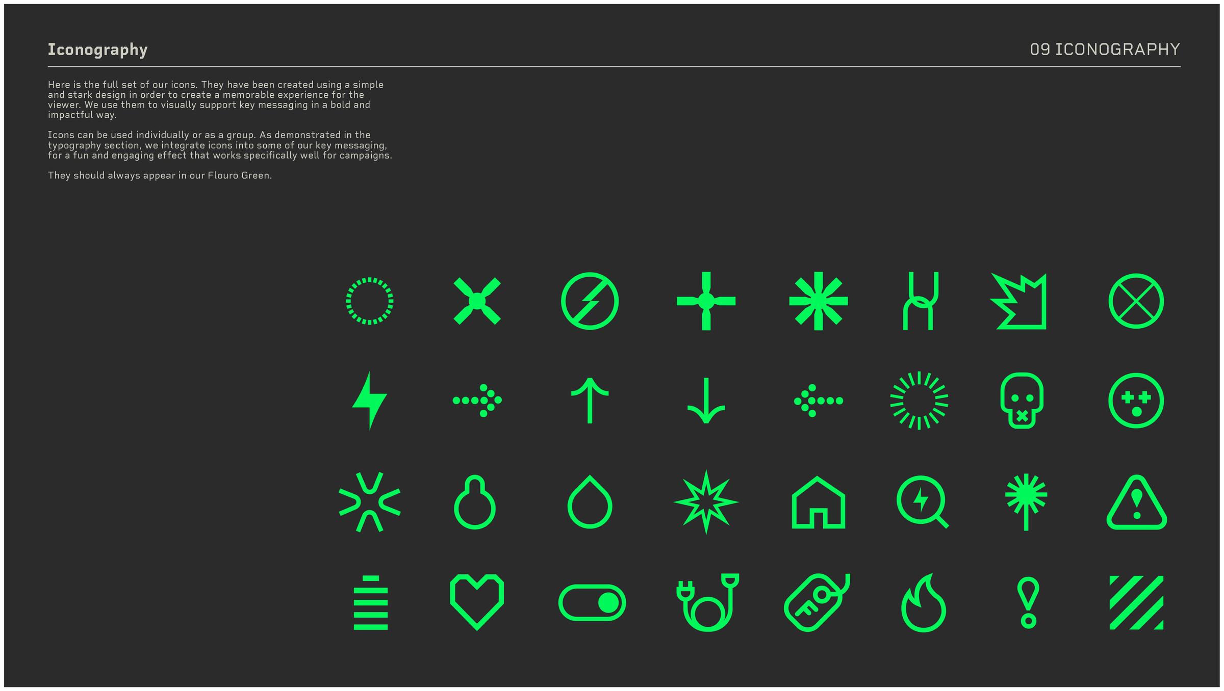
Added to these will be one of a wide range of iconography that has been created, as a key component of this new brand. These icons are modern, leading-edge but simple in style and can act as shorthand for many common electrical scenarios, such as fire, shock, explosion, toxic fumes, and the danger of water combining with electricity. They are created with digital marketing communications in mind and are fully animated. They will also integrate in execution with the sonic brand that Electrical Safety First is developing as the next key phase of its new brand roll out.
The new strapline, “Powering change + saving lives,” addresses the life-and-death nature of the charity’s work and highlights its triple-approach of: campaigning for legislative change; improving industry standards; and influencing consumer behaviour. The choice of using the positive ‘+’ icon rather than “and” or ampersand also symbolises a positive electric charge.
The brand audit exposed a lack of consistency in brand application across ESF’s conferences, campaigns and microsites. A clear sub-brand architecture has therefore been created, which ensures brand synergy across the charity’s many and varied activations and ensures the charity benefits from brand recognition derived, and these initiatives in turn benefit from leveraging the brand equity of this well-regarded charity.
Finally, the previous brand’s typeface was dated and failed to convey the charity’s reputation for world-class technical expertise. A modern, clean typeface, hinting at digital displays on electronic devices, has replaced it.
These new brand elements provide Electrical Safety First with a unique, ownable visual identity that cements it as a forward-looking, leading-edge organisation of national significance.
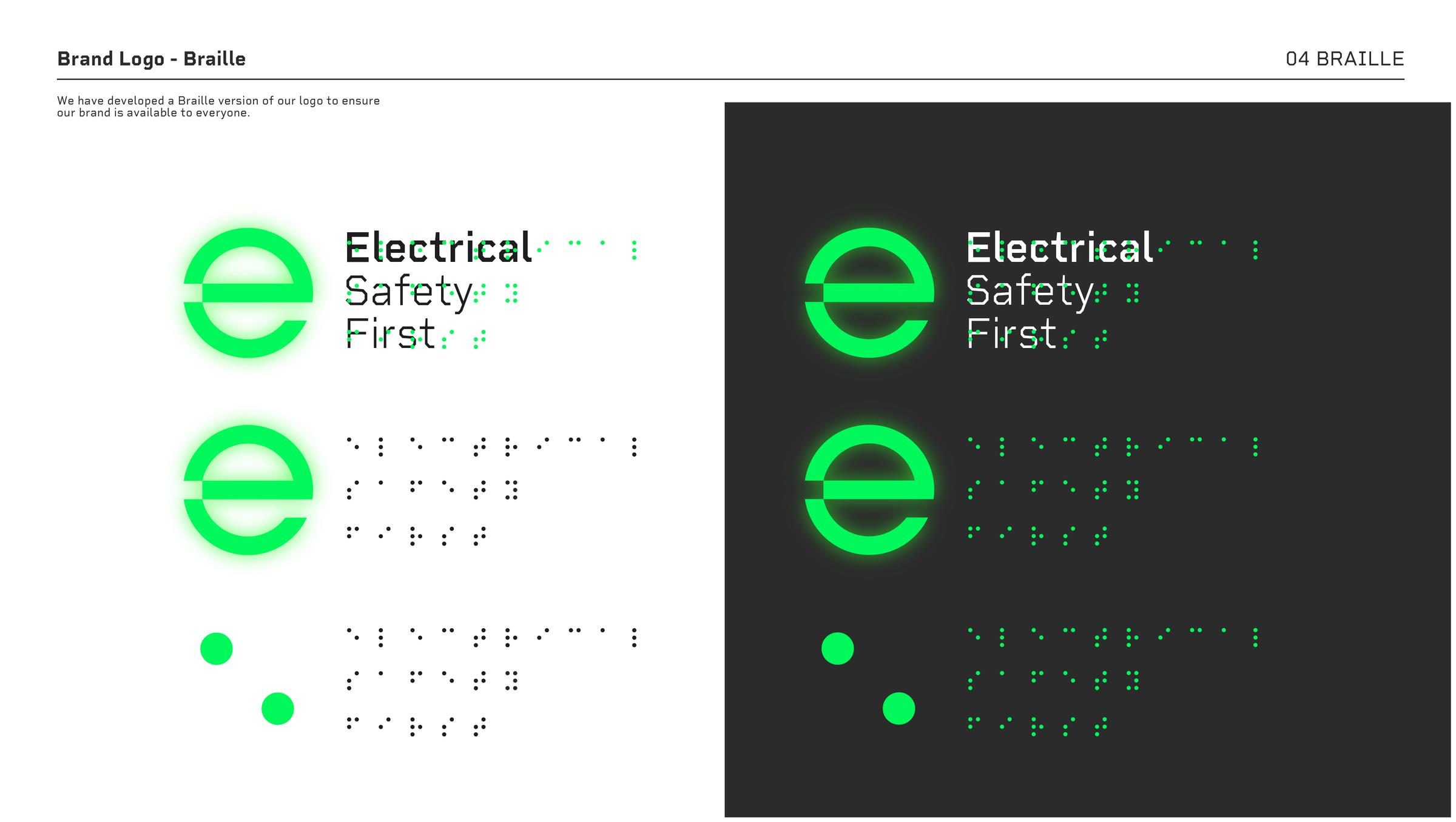
One of ESF’s core brand values is inclusivity, with ensuring accessibility for all being paramount. The new brand has been tested against DDA and W3C standards and braille versions of our logotype have been developed, ensuring that ESF's message is universally reachable.
Rory Carroll, Electrical Safety First’s Head of Communications, explains: “Our new identity represents our charity’s leading edge technical expertise. It’s a radical departure from the previous brand, propelling us into the AI digital age.
“Before a second was spent in the design studio, we conducted a comprehensive brand audit, which really built a deep foundation of learnings that steered the creation of this new brand world.
“Eight strong brand routes were considered, but there was one clear, unanimous winner. This concept our agency, Garden, developed is so clever. The glowing green ‘on’ graphical device looks stunning and has had similarly glowing feedback. Combined with the unique iconography, modern typeface and vibrant colour palette, we have an ownable brand and a clear brand strategy that will be relevant for decades to come.
“Tens of millions of us across the UK live with electricity coursing through the walls, ceiling and floors all around us, without even considering it. As we move towards net zero, electronic items will become an ever-increasing part of our existence.
“We are putting in place all the elements to ensure Electrical Safety First is there, as a resource, for everyone to safely enjoy this new electric age. Armed with the right information, people can avoid the dangers of electric shocks and fires.
“This new brand identity represents a new era of ambition for our charity. In an increasingly electric world we aim to be the go-to for expert guidance, protect users of electricity and electrical products and save lives.”
Sam Fraser Steel, Garden Head of Strategy, explains: “The Electrical Safety First re brand was a fascinating and important challenge, where a clearly understood and defined brand purpose has led to a strategic shift in visual identity.
“Our close collaboration with the ESF team has resulted in the creation of a dynamic and contemporary brand, that is both versatile and compelling, drawing individuals in with the allure of technological excitement, whilst at the same time effectively communicating safety critical messages.”
- Electrical Safety First’s major recent successes include launching the seminal Battery Breakdown report into the growing threat posed by lithium-ion batteries that power e-bikes and e-scooters. This achieved 697 individual pieces of media coverage within the first two days, and helped drive the issue high up the national agenda in media and Parliament.
- Its Don’t Be Electricked campaign has similarly highlighted the issue of deadly electrical goods being routinely sold on the likes of Temu and Facebook Marketplace.
- Whilst it has successfully secured legislation enforcing mandatory electrical safety checks in private and social rented accommodation in nations across the UK.
- In October 2023, it was awarded the Gold category PR Week Award for In-House Team of the Year (Public/Third Sector).
ESF’s next milestone activations include the development of a platinum-standard website, which will aim to be the world’s most comprehensive online resource for guidance on electrical safety. They will also produce a series of bite-size videos featuring their product safety experts, providing easily accessible advice for the UK public, across a wide range of issues. And it will continue to develop campaigns of national significance, based around primary investigations and research that commands national media attention and helps save lives through influencing laws, industry standards and raising awareness of safe practice to consumers.
ENDS
For more information on Electrical Safety First’s rebrand or its core work, please contact Rory Carroll, Head of Communications, on 07977 430 525 or rory.carroll@electricalsafetyfirst.org.uk.
Notes to editors
- Electrical Safety First is the leading UK charity dedicated to reducing deaths and injuries caused by electricity in UK homes. For more information, visit www.electricalsafetyfirst.org.uk.
- Garden are a London and Dubai-based agency. They comprise a unique blend of sound strategic insight, global brand experience, innovative thinking and highly creative solutions. For information, https://wearegarden.co.uk.
More background to Electrical Safety First’s new visual identity.
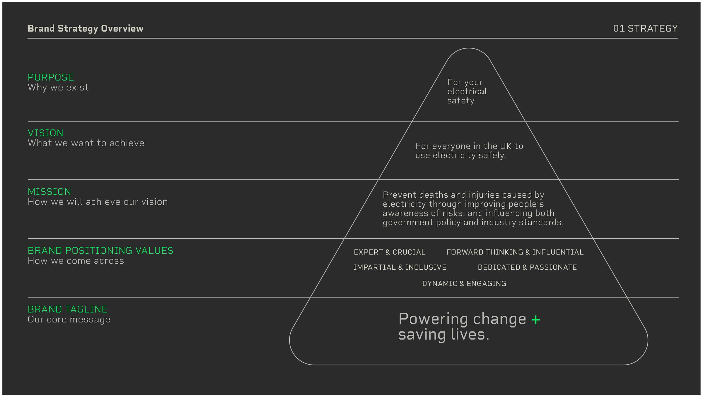
Brand Strategy – a new, extensive brand strategy has been created that underpins the new brand world created for Electrical Safety First. The below diagram details the purpose, vision, mission and brand values.
Colour palette – the below new palette, made up of vibrant, electric colours
Iconography – a new suite of icons provides the charity with the ‘shorthand for the new electric world’. Both young and old have become integrated into the world of shorthand, quick signposts through iconography, from our phones, to our hoovers to our cars.
Accessibility – Electrical Safety First’s new brand conforms to the highest standards of accessibility, with a braille version also developed.