
Recent research has revealed a series of startling results about safety in the home. The statistics aim to highlight different groups in society and the risky behaviours that they carry out. It also identifies the most dangerous time to in the home and the contributing factors that count towards this.
We've put together this infographic to raise awareness using our recent findings. Can you identify with any of the groups?
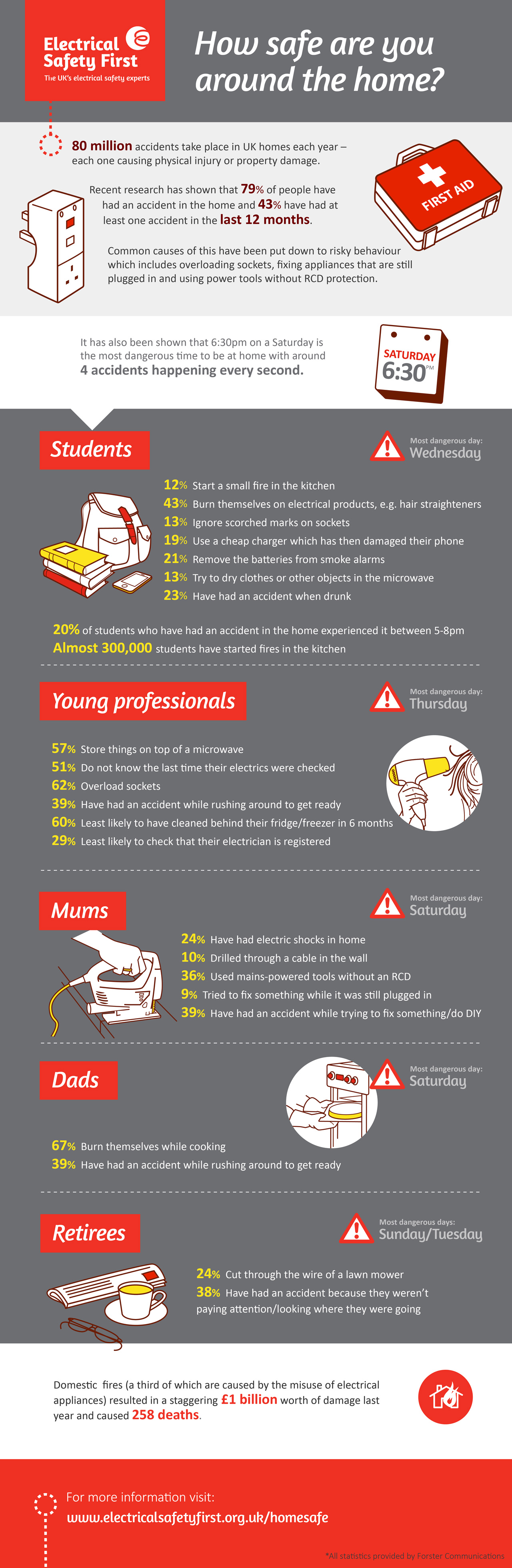
Display the 'How Safe Are You Around The Home' infographic on your site
Please feel free to embed our 'How Safe Are You Around The Home' infographic on your website, simply copy and paste the embed code below:
Code to insert
<a href="http://www.electricalsafetyfirst.org.uk/media/1064/safe-around-the-home-infographic-big-01.jpg" target="_blank"><img src="http://www.electricalsafetyfirst.org.uk/media/100370831/safe-around-the-home-infographic-big-01.jpg" alt="How Safe Are You Around The Home"></a></br>Source: How Safe Are You Around The Home infographic from <a href="http://www.electricalsafetyfirst.org.uk/news-and-campaigns/campaigns/how-safe-are-you-around-the-home-infographic/" target="_blank">Electrical Safety First</a>.
More posts by Penny Walshe


